
On this very day two years is where it all began. In a bewildered state, brought on by nerves, excitement, anxiety, confusion and not understanding half of the words people were using, I survived Graduate Interview Day and along the way met a whole slew of people, including the 11 people that I would be spending the next two years with. None of us knew if we were actually going to get in. All of us had our fingers crossed behind our backs, hoping that we could make it through the day without anyone finding out how much smarter they were then us...
///////////////////////////////////////////////////////////////
...I was scared out of my mind, had spent 14 hours, contemplative, in front of my closet trying to decide what to wear (and despite my sister's hesitation on the yellow and aqua combination I went with it anyways.) I can vividly remember Lauren's animal print shoes (how bold!) Everyone seemed way too smart for me. I didn't understand half the words people were saying. Meredith was laying down the law about the differences in graduate schools. Tony was asking about bringing dogs to studio, just then Denise's face lit up and she couldn't hold back an "awww." We all knew Tony was in. Tania secretly had Calvin with her at the interview. Brooke and Tania, the Bostonians, were already fast friends. Amber blew my mind with her thesis presentation. Marty was talking about slow food. I poured my heart out to Denise about wanting to change the world with design as she stared cold face back at me. Santiago gave his monologue to anyone that interviewed with him about all the fun things we were going to be doing. Liese and I stared with wide-eyes and bobbing heads not able to get a word in edgewise. We all experienced our first lunch on Hillsborough Street where we split up and then found ourselves all back in the same place when we arrived at Jasmine's. And I am sure there was a mention of the coffee shop going in next door to studio any day now...
What a day.
HAPPY ANNIVERSARY, PEOPLE!
[...]
February 11, 2010
January 30, 2010
Pivot
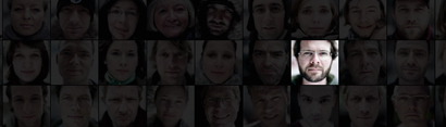
I don't know if it is the actual Pivot technology and capabilities or the music in the movie but I'm optimistic and I really want to get my hands on this thing. I can see now the trajectory of online "searching as consumption" to "searching as therapy" because, in the worlds of Microsoft Live Labs Development Manager Karim Farouki, "by allowing someone to move the data around we are allowing them to build a connection with that data, to feel emotionally involved and to be immersed in the experience itself." Check out my full post to watch the Pivot promo.
Just a curiosity here... where are all the women? Did they not have a woman on the development team?
[...]
Just a curiosity here... where are all the women? Did they not have a woman on the development team?
[...]
January 29, 2010
Graduate Symposium Re-Cap
Last weekend we pulled off the 2010 North Carolina State University College of Design Biennial Graduate Symposium entitled Design, Community and the Rhetoric of Authenticity. When we first began the discussions around the topic in studio, to be honest, I was less than thrilled. It seemed entirely too nebulous, too vaporous, too undefinable. How could we ever have an entire symposium centered around a topic where we all couldn't even agree on what the words in the title meant??? This was the practical side of me rearing its head. But eventually I began to get more and more comfortable with the idea of un-finish, of verbalizing thoughts in motion and of embracing and celebrating the debate.
/////////////////////////////////////////////////
At the end of the symposium we had asked a team of graduate students from a range of grad programs to react to the overall symposium, sum things up and bring it home for us. They got all conceptual on us and did a spoken word routine where they each spoke a particular thought, line or quote that resonated with them from throughout the weekend in order of its happening. This went around and around a couple times before we arrived at the most resonating call to actions found in the final lecture. I had found this particularly interesting because I too was, of course, taking notes all weekend long and jotted down some particular things that spoke to me. I thought I would include some of them here for you in my recap of the weekend...
"Authenticity may not be real, but soul is real." - Elliot Earls
"You can see soul in music. You can see it in art." - Earls
"Authenticity is totally situated." - Brenda Laurel
"I can f@*king feel it when work is authentic." - Earls
"Isn't advertising ultimately a culturally sanctioned form of lying?" - Earls
"Designing for yourself is something I am very wary of." - Laurel
"Who has the capability to design something authentic and in what context." Jon Sueda
"The original recipe is always the most authentic." - Sueda
"We achieve authenticity when the idea is resistant to mutation." - Gary Dickson
"Where do stereo types and nostalgia fit into the rhetoric of authenticity." - Leslie Atzmon
"71% of Americans are online. How does this affect authenticity?" - Q&A Session
"We are insiders." - Maggie Fost on Merge employees
"To be a tourist is being someone who is knowingly having an inauthentic experience." - Unknown, quoted by Maggie Fost
"Designers are fans with access, which situates us to be incredible tour guides." - Fost
"Popular authenticity doesn't free music, it kills it." - Ken Fitzgerald
"All things are subject to interpretation. Which interpretation prevails at the time are a product of power and not truth." - Friedrich Nietzsche
"Technology affords us a way of communicate but it also allows us to isolate ourselves." - Unknown, from break-out session
"In the moment we deem something authentic it ceases to be authentic." - Joerg Becker
[...]
January 25, 2010
Disguised to ourselves.
"We are so accustomed to disguise ourselves to others that in the end we become disguised to ourselves." - Francois de La Rochefoucauld, French author & moralist (1613 - 1680)
[...]
[...]
January 12, 2010
Graduate Symposium
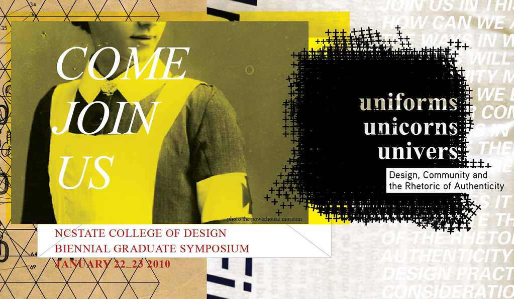
The NCSU College of Design Biennial Graduate Symposium is only a week and a half away and we are pumped!
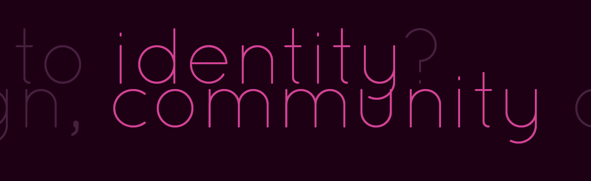
From the built environment to the virtual realm of interface, design persuades individuals and communities of the truth, honesty, and realness of objects, spaces, and systems. These tactics of persuasion amount to what may be called a rhetoric of authenticity.
////////////////////////////////////////////////////////////////
Though designers employ this rhetoric, communities ultimately decide what is authentic to them. Design anthropologist Dori Tunstall describes five requisites of communities: commonality in terms of historic consciousness, life goals, organizational structures, relationships, and conceptions of individual agency. Can considering how the rhetoric of authenticity relates to these defining characteristics of communities help identify points of engagement with complex and discriminating audiences?
This symposium will explore the rhetoric of authenticity within design practices and for community experience. We will confront provocative issues relating to designers’ roles and responsibilities to communities and the individuals who comprise them. Join us in this dialogue.
+ How can we anticipate the ways in which our designs will be read by community members?
+ How can we design to empower community audiences in ways that increase their agency and nurture their identities?
+ What does it mean to appreciate the power of the rhetoric of authenticity in our design practices and considerations of community?
+ How might social, political, and economic constructs influence perceptions of authenticity in design?
+ What constitutes authentic experience, relative to design?
[...]
January 11, 2010
Scared To Death
“Anything I’ve ever done that ultimately was worthwhile...initially scared me to death.” ― Betty Bender
This quote, as it applies to my life today, refers to my thesis, naturally, and trying out the coffee from the new convenience store next door to studio. The coffee has proven to be worthwhile. We will see what happens with thesis.
[...]
This quote, as it applies to my life today, refers to my thesis, naturally, and trying out the coffee from the new convenience store next door to studio. The coffee has proven to be worthwhile. We will see what happens with thesis.
[...]
November 12, 2009
Fall 09 / P3 / Symposium Foray / Draft 2
For the second round of this project, embodied in this stop frame animation, I am exploring self expression, the construction of an authentic self and how these expressions are shaped by community.
Identity & Community from Caroline Prietz on Vimeo.
[...]October 26, 2009
Fall 09 / P3 / Symposium Foray / Draft 1
As second year students for Project 3 we are to "Propose and complete a design study that addresses an intersection (a point) rooted in (1) your thesis questions and (2) an aspect of the symposium theme "Design, Community and the Rhetoric of Authenticity." So I suppose it is time... time to unleash the researchable question that has remained under wraps for some time now. Please, treat it gently. It is just a babe, still in the making...
How can the design of interactive spaces lead a female college student through an evaluation of material consumption behaviors in relation to identity?
In these initial stages I find myself particularly interested in the notion of identity which fundamentally refers to the way in which one perceives one’s self. This could come from internal or external sources. But I am most interested in how this is persuaded by and communicated to the individuals peers and/or community. Thus the intersection. Identity and Community.
///////////////////////////////////////////////////////////////////////
In Thomas Cottle's book, Mind Fields, Cottle suggests that "...adolescents discover they are able to reflect on the stories they tell about others and themselves just as they are able to reflect on their own reflections. Their work, as it were, is to construct identities and develop a consolidated sense of self which they do in part from private reflection and in part from trying out bits of themselves, the products of these self-reflections, on the world. In sharing their reflections, adolescents open themselves to the possibility that their developing selves will be confirmed by others, although there is always the possibility of disconfirmation as well."
Erik Erikson expressed the notion this way: "The sense of ego identity, then is the accrued confidence that the inner sameness and continuity prepared in the past are matched by the sameness and continuity of one's meaning for others...." Believing this to be true, peer groups and gangs assume new significance, because peers contribute to the development of an individual's most private readings of his or her self."
This information on adolescents is particularly interesting because of my thesis focus on college aged women (18-22 years of age), but I do believe that the notion of reflecting on one's sense of self and trying out identities happens at many different stages of life, especially while in transition. Currently for myself I am attempting to establish what my own voice may be in the discourse of design. How your community and peers receives this expression of one's self is something that is often, if not always, considered.
Then I found this interesting study...
In the New York Times article, "Are Your Friends Making You Fat?" a pair of social scientists named Nicholas Christakis and James Fowler say, "they have for the first time found some solid basis for a potentially powerful theory in epidemiology: that good behaviors — like quitting smoking or staying slender or being happy — pass from friend to friend almost as if they were contagious viruses." Just some social science evidence for peer pressure? In the article they talked about visualizing the data they collected based on where people lived and how their weight fluctuated throughout the years. They saw that people gained and lost weight in "pods" throughout the community. This got me to thinking. In what ways are our own expressions of identity influenced by our peers and how may this be brought into consideration through illumination?
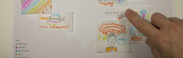
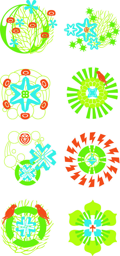
I discovered a school project of Marian Bantjes on Design Observer in which she explored the distinct graphic language of heraldry, the system by which coats of arms and other armorial bearings are devised, described and regulated. Bantjes describes that "heraldry is a lost vocabulary. Every symbol, shape, colour and arrangement of colour means something." In Bantjes project she uses the graphic language of crest making to develop system for logo making, in which everything means something (industry, size of company, mergers, etc) and thus the logo is read as an actual expression of the identity of the company.
This project was curious to me. These ultimately are expressions of identity and, while vast in numbers, similar elements are used throughout them all. Crests can be read and also related. They can show connections. Or rather, illuminate. I decided to do my own explorations in crest making and here is the plan I came up with:
IDEA 1:
Showing Connections to Peers.
Personal Crest Making:
Express values through a combination of symbols to create a crest or shield that represents the participants own (design philosophy) identity.
Pros: Illustrates connections
Cons: Little room for originality or personal expression.
Part 1 - Questionnaire:
1) participant is asked a series of questions based on relational facts. (where they live, who their friends are, where they were born, etc. This is to be used for placement of the symbols on a large "map" in order to illustrate connections.)
2) next the participant is asked a series of questions pertaining to their own values and sense of self. (this is used to create their personal expression in a crest/symbol)
Part 2 - Kit for Creation:
3) based on their responses they then get a kit of symbols/tools to for creation.
4) individuals with similar answers get similar symbols/tools
5) participant then has their own creative freedom to utilize the symbols to create their own personal identity crest.
Some ideas for how this could play out:
- participants walk into a room with bags with labels. If you associate with the label you grab the tool to create with out of the bag.
- stencils to create on shirt.
- participants complete the questionnaire digitally and then are provided with a set of tools/symbols and a space to create (like Illustrator). Then they submit their creation to be displayed on the larger map. And possibly create a wearable form of the identity crest.
- could be made using transparencies and projectors.
The idea is that people with similar values will be using the same tools and/or symbols. Their expressions with these things will vary but they will still be able to see the connections with like minded people.
Part 3 - Mapping Connections:
Ultimately the connections need to be visualized whether the participant is allowed to simply wear their identity crest and notice the connections amongst their peers or the creations are plotted on a digital map that groups the identity crests based on their responses to the relational questions (geographically, by friendships, etc.)
Could these be something that happens over time? People contribute over the course of time to build the map or graphic that grows and shows connections and associations.
IDEA 1 - PLAYING OUT:
Participants are asked a series of four questions with six possible answers. Based on each answer they are assigned a symbol to use for creating their identity crest.
Tools for creation for each question (each color represents a different question set):
Utilizing the one assigned symbol from each question (totaling four) and a bit of creative freedom the participant creates their own personal identity crest.
Some hypothetical identity crests:
///////////////////////////////////////////////////////////////////////
IDEA 2:
I am still interested in the connection between the outward expression/appearance and the inner thought. How authentic is the outward expression to the inner thought?
Language Labels: Expressions through language.
Playing off of the fears that may come from expressing an identity the individual answers questions about themselves based on scenarios that they may encounter and is then assigned a negative expression based on their decision.
EXAMPLE SCENARIO QUESTION:
My group of friends from the office are trying out a new restaurant for lunch, which is said to be kind of pricey. When they ask if I want to go I decide to...
a. go on ahead, money is not an issue.
b. go on ahead despite my budgeting restraints.
c. turn the offer down because I brought my own lunch and don't stray off the plan.
d. turn the offer down because I didn't budget for the extra $5 dollars the lunch will cost me.
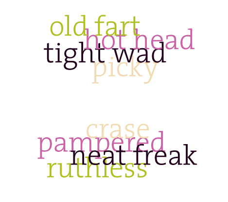
Based on the answers the individual collects a negative word associated with their response.
a. pampered
b. weak
c. fuddy dud
d. tight wad
They continue to answer a series of questions which creates a collection of negative words that they then rate as more or less authentic. Do they then have to display this expression?
Some hypothetical word creations:
or
IDEA 2.5:
Still using the Language Labels. The idea is to attempt to create an authentic expression through language.
The individual answers questions about themselves based on scenarios that they may encounter. Then is given a range of expressions (from negative to positive) based on their decision in which they choose which best describes themselves (a.k.a. - the most authentic).
EXAMPLE SCENARIO QUESTION:
My group of friends from the office are trying out a new restaurant for lunch, which is said to be kind of pricey. When they ask if I want to go I decide to...
a. go on ahead, money is not an issue.
b. go on ahead despite my budgeting restraints.
c. turn the offer down because I brought my own lunch and don't stray off the plan.
d. turn the offer down because I didn't budget for the extra $5 dollars the lunch will cost me.
Based on the answers the individual is given a selection of words to choose from.
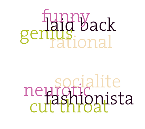
a. stable, spoiled, pampered
b. socialite, foodie, weak
c. rational, practical, fuddy dud
d. money smart, budgeter, tight wad
The creation is then a somewhat more authentic expression of their own identity.
Some hypothetical, aunthentic word creations:
[...]
October 13, 2009
Fall 09 / P2 / An Initiation
Visual conventions, visual rhetoric or anything of the like has been the buzz around studio for the past few weeks. What are they? Where are they found? How do we as designers contribute to, create or disrupt them? Next we did experiments in "hybridization" attempting to infuse new visual conventions into the old. Attempting to lead our communities down a path. For the project we were to...
1. Identify : existing visual conventions of the community you have selected to study in seminar.
2. Design : An Initiation to ________ , introducing new visual conventions that might logically follow, or interrupt, if such is the more compelling strategy. Any media, any point of delivery.
...and we were off.
/////////////////////////////////////////////////////////////////////
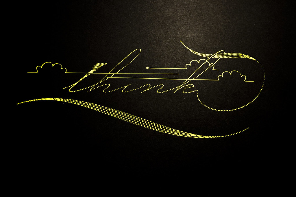
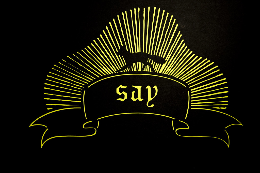
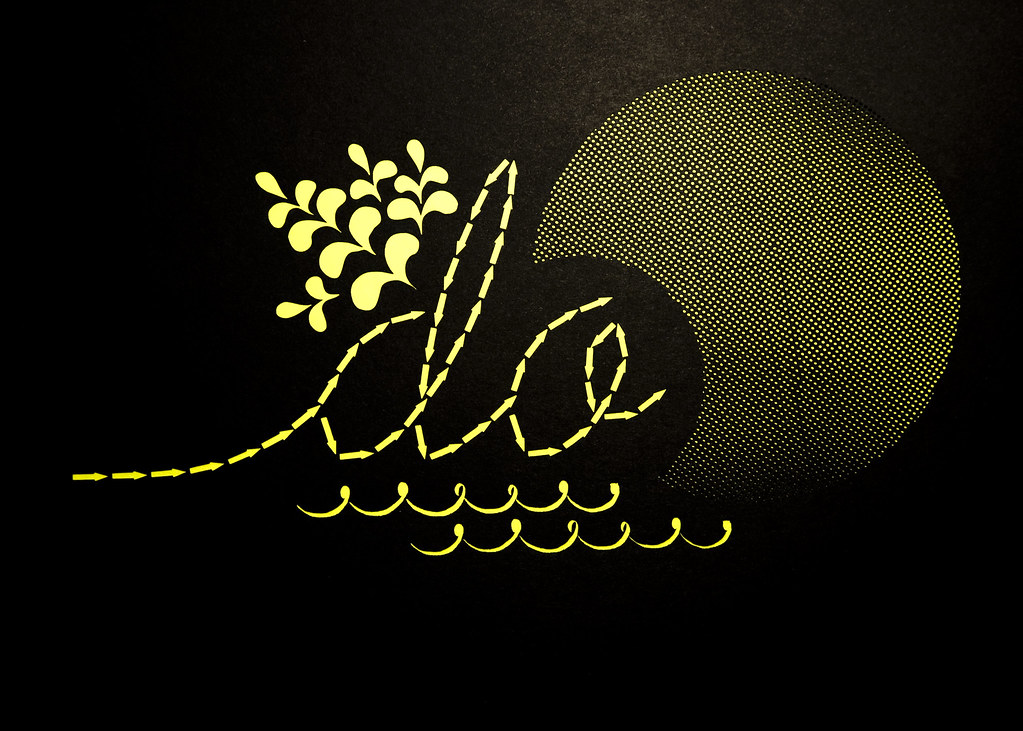
My community of intrigue for this entire semester has been Weardrobe.com, a social platform for personal fashion. It is a fashion-focused community for discovering different ways to wear clothing. Weardrobers are all about imagination and creativity over consumption. After much consideration my initiation for the community is into ACTIVISM. And here is my proposal...
Weardrobe community members are invited to participate in a contest rooted in activism. The "Think, Say, Do" campaign encourages members to think creatively about how to incorporate the campaign's branding via tools/stencils into their wardrobe and fashion statements. I developed a branding for the campaign that utilizes the rich "mixing up" visual strategy that Weardrobe embraces. Their fashion ensembles include a mix of high and low fashion as well as their own DIYed pieces. These branding visual elements I came up with were translate into tools for creation (a.k.a. stencils) that I created using black card stock and the handy laser cutter. Here is how it is explained in the packet the Weardrobe participant receives...
Think / Say / Do: The Compliment Campaign.
Sponsored by American Apparel.
Think:
Utilizing the provided stencils and fabric paint get creative and "style up" an existing fashion piece in your wardrobe. Next, submit a photo of you wearing your creation to the Think/Say/Do Weardrobe Competition online. Most importantly, check out the charities listed and select one to represent.
Say:
Compliments equal Cash. Get online and compliment/comment on other participants creations if you dig 'em. Let your friends know to compliment your creation.
Do:
Compliments will be tallied up and American Apparel with donate $1 for each compliment received by the contest winner to their chosen charity.
[...]
October 1, 2009
Fall 09 / Thesis / Begins
Thesis. It is well on its way by now. So I thought I would take some time to step back, examine my process up to this point and share it with you here:
I began my explorations when I began evaluating why I even wanted to come back to graduate school. I gave my best miss america speech in my statement of purpose about wanting to explore how design could make this world a better place for an individual, a community and society as a whole. And I have held onto those roots, I would say, in exploration.
//////////////////////////////////////////////////////////////////
When first doing thesis research I found myself drawn to the area of emotional design. I explored the way emotions play a role in our decision making process. I latched onto the idea of "happiness" and wanted to promote positive thinking. I searched for a way that design could encourage behaviors that would lead to positive emotions. In my research I found that while the world tends to be grasping for happiness in general they are running off in well intended directions that take them further and further away from actually achieving that goal. The economic crisis we are facing now is a direct effect of one of those ill adviced paths, consumerism and the pursuit of material things.
In the Fast Company article "The Happiness Factor", James Roberts, a Baylor University marketing professor says '"all that consumerism is a pursuit of something other than Happiness: "The research is overwhelmingly clear," he says. "The more materialistic you are the less happy you are. We get Happiness through the love of others and sense of community. But we've been told by Madison Avenue that Happiness can come through the mall."' (The Happiness Factor, Fast Company) In the same article Cynthia Crossen of The Wall Street Journal notes, the American "pursuit of Happiness" certainly is of a piece with America's "capitalist democracy, where ever-increasing consumption" drives economic growth. (The Happiness Factor, Fast Company)
Why is it that it seems we are caring more for our economy and less for the individual? Does the economy shape the perception and well-being of the individual or is it the other way around. Does the individual shape the well-being of the economy?
Effective meaningful sustainable change has to come from inside first. And the heart of our economy is the individual. The heart of the individual is shaped from a very young age. Perceptions are developed, expectations are formed without any conscious knowledge. And how is this done? Through the examples set by others, such as parents, yes, but also through advertising and it's messages. In Jean Kilbourne's You Can't Buy My Love, she reports "that the average American sees more than three thousand ads per day and spends more than three years of his or her life watching commercials. Their messages are inside our intimate relationships, our homes, our hearts and our heads." (Kilbourne 12) There is no way to escape the pervasiveness of material culture and consumerism. And we as designers... what are we doing? We are the ones creating the tools for persuasion. We are complacent to the effects this has on the well-being of the individual. We are in many ways the vehicle to unhappiness.
One of the most targeted age groups for Credit Card companies are college students. Because students are a prime marketing opportunity. “If they can be in that kid’s wallet, they are more likely to have a customer for a good long time,” explains Geri Detweiler of ultimatecredit.com. (Weisbaum) Fresh from the material and financial comforts of home, guarded from the financial decisions their parents have had to make and the hardships they may have had to endure, college students often times have no concept of how personal economics work.
In a Newsweek article from early 2009 it reports how susceptible young college students are to building debt through credit cards. "The Center for a New American Dream, a group focused on helping Americans spend wisely, found that more than half of American college students signed up for at least four credit cards by the time they graduated. These card-stacked wallets help explain why, according to U.S. PIRG, the average American senior now racks up more than $2,500 in credit-card debt by the time they receive their diploma." (Soller, Majoring In Debt / Newsweek)
In today's economy the need for regulation is evident and laws are being past to limit the ways in which credit card companies target college students. Credit card companies may unjustly target college students by luring them with gifts and trinkets without explaining the real risks involved there is something inside the student to acquire that must be addressed. In "Can't Buy My Love," Kilbourne reminds us that for young adults advertising continues to invade their lives and "ads constantly tell us that products can help us find our identity, can make us unique, can help us understand ourselves and each other better." (Kilbourne, 91) In this new environment these students are well versed in self-expression through social media. Society is taught that you are what you own and that it is through these possessions that we can portray our desired sense of self.
SOURCES:
Kilbourne, Jean. Can't Buy My Love How Advertising Changes the Way We Think and Feel. New York: Free, 2000. Print.
Manners, Tim. "The Happiness Factor." Fast Company. 08 July 2008. Web. 23 Aug. 2009..
Soller, Kurt. "Majoring In Debt." Newsweek. 17 Feb. 2009. Web. 23 Sept. 2009..
Truth About Credit. Web. 23 Sept. 2009..
Weisbaum, Herb. "Credit cards: A dangerous convenience." MSNBC. msnbc.com, 11 Aug. 2006. Web. 23 Sept. 2009..
[...]
I began my explorations when I began evaluating why I even wanted to come back to graduate school. I gave my best miss america speech in my statement of purpose about wanting to explore how design could make this world a better place for an individual, a community and society as a whole. And I have held onto those roots, I would say, in exploration.
//////////////////////////////////////////////////////////////////
When first doing thesis research I found myself drawn to the area of emotional design. I explored the way emotions play a role in our decision making process. I latched onto the idea of "happiness" and wanted to promote positive thinking. I searched for a way that design could encourage behaviors that would lead to positive emotions. In my research I found that while the world tends to be grasping for happiness in general they are running off in well intended directions that take them further and further away from actually achieving that goal. The economic crisis we are facing now is a direct effect of one of those ill adviced paths, consumerism and the pursuit of material things.
In the Fast Company article "The Happiness Factor", James Roberts, a Baylor University marketing professor says '"all that consumerism is a pursuit of something other than Happiness: "The research is overwhelmingly clear," he says. "The more materialistic you are the less happy you are. We get Happiness through the love of others and sense of community. But we've been told by Madison Avenue that Happiness can come through the mall."' (The Happiness Factor, Fast Company) In the same article Cynthia Crossen of The Wall Street Journal notes, the American "pursuit of Happiness" certainly is of a piece with America's "capitalist democracy, where ever-increasing consumption" drives economic growth. (The Happiness Factor, Fast Company)
Why is it that it seems we are caring more for our economy and less for the individual? Does the economy shape the perception and well-being of the individual or is it the other way around. Does the individual shape the well-being of the economy?
Effective meaningful sustainable change has to come from inside first. And the heart of our economy is the individual. The heart of the individual is shaped from a very young age. Perceptions are developed, expectations are formed without any conscious knowledge. And how is this done? Through the examples set by others, such as parents, yes, but also through advertising and it's messages. In Jean Kilbourne's You Can't Buy My Love, she reports "that the average American sees more than three thousand ads per day and spends more than three years of his or her life watching commercials. Their messages are inside our intimate relationships, our homes, our hearts and our heads." (Kilbourne 12) There is no way to escape the pervasiveness of material culture and consumerism. And we as designers... what are we doing? We are the ones creating the tools for persuasion. We are complacent to the effects this has on the well-being of the individual. We are in many ways the vehicle to unhappiness.
One of the most targeted age groups for Credit Card companies are college students. Because students are a prime marketing opportunity. “If they can be in that kid’s wallet, they are more likely to have a customer for a good long time,” explains Geri Detweiler of ultimatecredit.com. (Weisbaum) Fresh from the material and financial comforts of home, guarded from the financial decisions their parents have had to make and the hardships they may have had to endure, college students often times have no concept of how personal economics work.
In a Newsweek article from early 2009 it reports how susceptible young college students are to building debt through credit cards. "The Center for a New American Dream, a group focused on helping Americans spend wisely, found that more than half of American college students signed up for at least four credit cards by the time they graduated. These card-stacked wallets help explain why, according to U.S. PIRG, the average American senior now racks up more than $2,500 in credit-card debt by the time they receive their diploma." (Soller, Majoring In Debt / Newsweek)
In today's economy the need for regulation is evident and laws are being past to limit the ways in which credit card companies target college students. Credit card companies may unjustly target college students by luring them with gifts and trinkets without explaining the real risks involved there is something inside the student to acquire that must be addressed. In "Can't Buy My Love," Kilbourne reminds us that for young adults advertising continues to invade their lives and "ads constantly tell us that products can help us find our identity, can make us unique, can help us understand ourselves and each other better." (Kilbourne, 91) In this new environment these students are well versed in self-expression through social media. Society is taught that you are what you own and that it is through these possessions that we can portray our desired sense of self.
SOURCES:
Kilbourne, Jean. Can't Buy My Love How Advertising Changes the Way We Think and Feel. New York: Free, 2000. Print.
Manners, Tim. "The Happiness Factor." Fast Company. 08 July 2008. Web. 23 Aug. 2009.
Soller, Kurt. "Majoring In Debt." Newsweek. 17 Feb. 2009. Web. 23 Sept. 2009.
Truth About Credit. Web. 23 Sept. 2009.
Weisbaum, Herb. "Credit cards: A dangerous convenience." MSNBC. msnbc.com, 11 Aug. 2006. Web. 23 Sept. 2009.
[...]
September 16, 2009
Fall 09 / P1 / Cultural Probe / Round 2
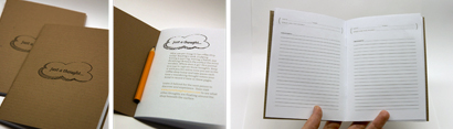
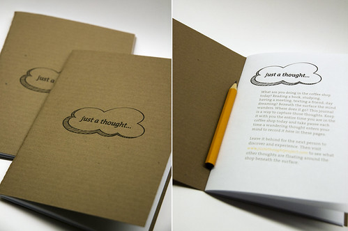
The Thought Journal: When re-evaluating my "thought catcher" I realized that I am interested most in the thought, where the mind wanders while engaged in the ritual of being in the coffee shop. I don't want to be too intrusive in their process I just want to capture the thought as it is happening. And in return make the person aware of the wandering thoughts.
My New Idea: Provide a Thought Catching Journal that is left on the tables for the individual to discover, contribute and explore.
An interior page reads,
"What are you doing in the coffee shop today; reading a book, studying, having a meeting, texting a friend, day dreaming? Amidst this facade the mind wanders. Where does it go? This journal here is a way to capture those thoughts. Keep it with you the entire time you are in the coffee shop today and take pause each time a wandering thought enters your mind to record here in these pages.
Before you leave return the thought journal to the collecting bin near the doors and visit www.justathoughtproject.com to see what other thoughts are floating around the shop beneath the surface."
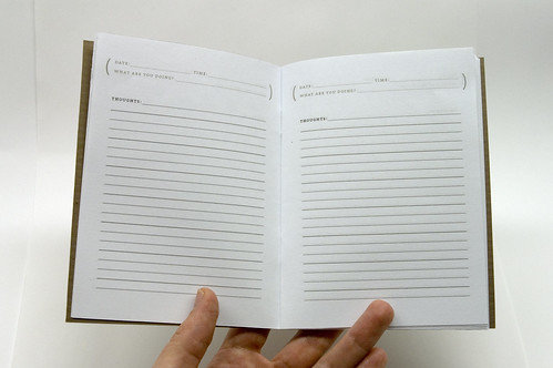
Each page has a place at the top to record the date, time and what they are doing at that time, then space for their thoughts.
[...]
September 11, 2009
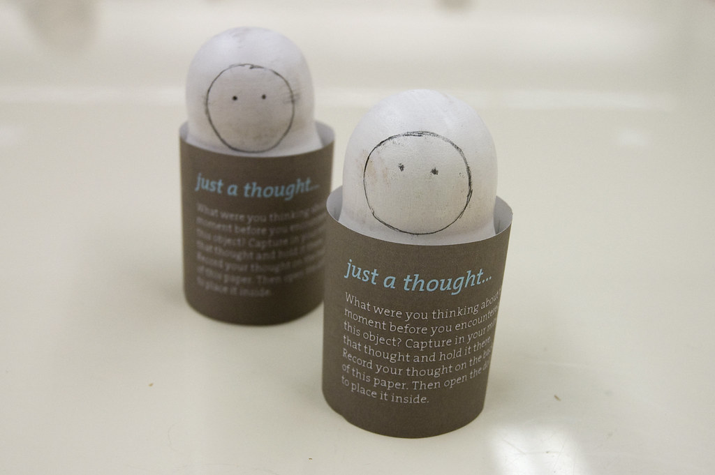
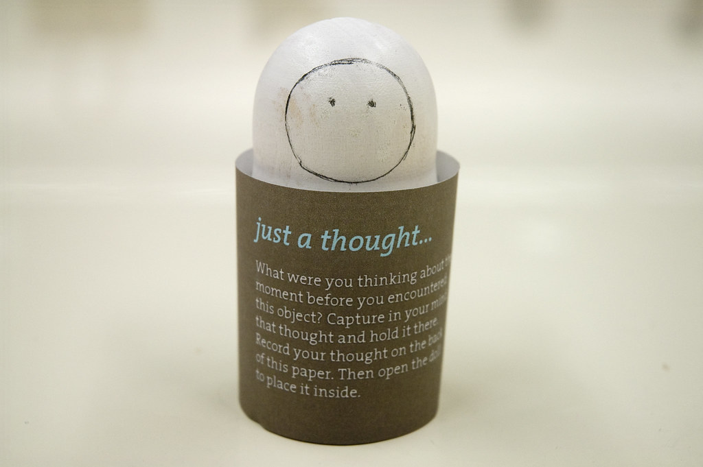
Fall o9 / P1 / Cultural Probe / Round 1

The Thought Catcher: Ritual and a Cultural Probe: Are the rituals performed in the coffee shop experience just part of an illusion of busyness or importance, a facade? Where does the mind wander during those ritualistic experiences? What are the thoughts beneath the surface of ritual?
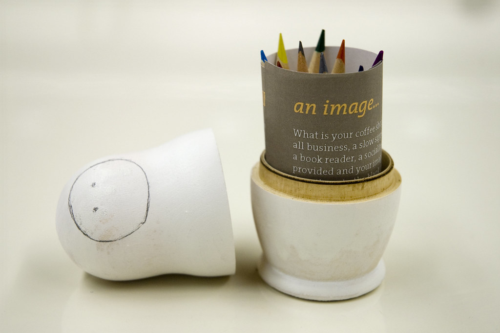
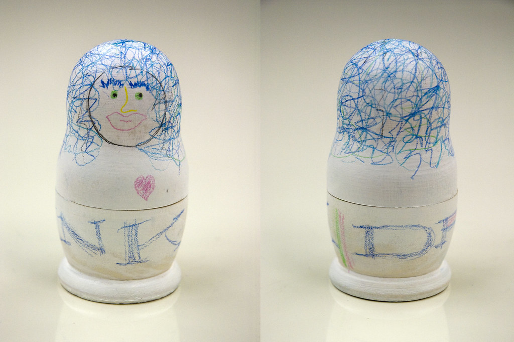
My Probe: A single blank nesting doll is left randomly on tables, with a kit for creation inside including, a sheet of paper with directions and small colored pencils.
The customer is first prompted to capture what they were thinking of the second before they encountered the doll and write that thought on a piece of paper that will then be rolled up and placed inside the nesting doll. They are then encouraged to imaginatively represent their coffee shop persona on the outer most doll (through drawing, color, writing, etc.) and prompted to create directly onto the blank canvas of the doll.
The directions read:
just a thought...
What were you thinking about the moment before you encountered this object? Capture in your mind that thought and hold it there. Record your thought on the back of this paper. Then open the doll to place it inside.
An image...
What is your coffee shop persona? Are you all business, a slow sipper, a day dreamer, a book reader, a socialite? Using the tools provided and your imagination create directly onto the blank canvas of the doll a representation–a sketch, a sentence, or perhaps a single word–of who you are and what you do while here in this coffee shop.
and finally...
Place your captured thought and tools back into the doll and leave it in the collection bin near the register.
Then visit www.justathoughtproject.com
to view other representations and thoughts as well as your own.
Some creativity during critique...
contributors: Cady Bean-Smith, Tania Allen & Lauren Waugh...


contributors: Denise Gonzales Crisp, Kelly Bailey & Laura Rodriguez...
[...]
September 8, 2009
Fall 09 / Cultural Probe / Findings
Upon explorations and musings on cultural probes getting at ritual I found that I am interested in where the mind wanders during those ritualistic experiences. What are the thoughts beneath the surface of ritual? And how can they be visualized? A "thought catcher" in a way. My classmate Tania, turned me towards a rather compelling photographic study (wish I would have thought of this on my own, and never told that this actually existed, although my photographs couldn't have been nearly as breathtaking). Explore The Thought Project by Simon Hoegsberby. [...]
September 3, 2009
Fall 09 / P1 / A Story
This semester is all about culture (Design as a Cultural Experience, to be exact). We could sit in the studio discussing culture round the clock (which I am sure we will take a stab at), and/or we could get out there and experience, observe, explore and wonder a bit. We start things off with the latter. For seminar we are to take a stab at a Thick Description (See Clifford Geertz's writings on this). The description is to be based off of observations in a local coffee shop. I camped out in a Starbucks on the corner of Gleenwood Ave. and Peace St. and the fun began. From our observations we began our first Studio Project...
The assignment: Write a story from the perspective of a player in the experience, i.e. a particular customer, barista, dishwasher, busboy, manager, delivery person, etc.
I choose a curiously contemplative customer. Check mine out:
Blessed rain. I hadn't had the heart to look out my park facing windows for several weeks now and watch as the grass turned to brown. Loraine would have loved this drop in temperature. She would have pulled out her fingerless gloves her daughter had made, then tugged at the imperfections. She would have reminisced about the good old days when we were neighbors, young mothers, with "tight assess", she would have said, on that Michigan cul-de-sac. I would have laughed then prayed that any foul language that finds its way out of her lips will taste like dirty gravel in her mouth.
Dear God, give Loraine's family the strength for another day and unwavering faith. I pray that you will soften their hearts to your words, to your guidance and that when unforgiveness tries to take root in their soul that YOU will pluck it out by the roots and replace it with the peace that passes all understanding. I pray that when all else fails...
Oh, is this a break in the rain? I should go now so I don't have to fumble with that awful umbrella.
[...]
Subscribe to:
Posts (Atom)