For the second round of this project, embodied in this stop frame animation, I am exploring self expression, the construction of an authentic self and how these expressions are shaped by community.
As second year students for Project 3 we are to "Propose and complete a design study that addresses an intersection (a point) rooted in (1) your thesis questions and (2) an aspect of the symposium theme "Design, Community and the Rhetoric of Authenticity." So I suppose it is time... time to unleash the researchable question that has remained under wraps for some time now. Please, treat it gently. It is just a babe, still in the making...
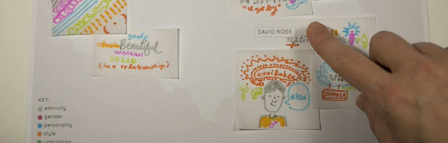
How can the design of interactive spaces lead a female college student through an evaluation of material consumption behaviors in relation to identity?
In these initial stages I find myself particularly interested in the notion of identity which fundamentally refers to the way in which one perceives one’s self. This could come from internal or external sources. But I am most interested in how this is persuaded by and communicated to the individuals peers and/or community. Thus the intersection. Identity and Community.
In Thomas Cottle's book, Mind Fields, Cottle suggests that "...adolescents discover they are able to reflect on the stories they tell about others and themselves just as they are able to reflect on their own reflections. Their work, as it were, is to construct identities and develop a consolidated sense of self which they do in part from private reflection and in part from trying out bits of themselves, the products of these self-reflections, on the world. In sharing their reflections, adolescents open themselves to the possibility that their developing selves will be confirmed by others, although there is always the possibility of disconfirmation as well."
Erik Erikson expressed the notion this way: "The sense of ego identity, then is the accrued confidence that the inner sameness and continuity prepared in the past are matched by the sameness and continuity of one's meaning for others...." Believing this to be true, peer groups and gangs assume new significance, because peers contribute to the development of an individual's most private readings of his or her self."
This information on adolescents is particularly interesting because of my thesis focus on college aged women (18-22 years of age), but I do believe that the notion of reflecting on one's sense of self and trying out identities happens at many different stages of life, especially while in transition. Currently for myself I am attempting to establish what my own voice may be in the discourse of design. How your community and peers receives this expression of one's self is something that is often, if not always, considered.
Then I found this interesting study...
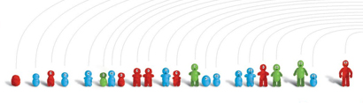
In the New York Times article, "Are Your Friends Making You Fat?" a pair of social scientists named Nicholas Christakis and James Fowler say, "they have for the first time found some solid basis for a potentially powerful theory in epidemiology: that good behaviors — like quitting smoking or staying slender or being happy — pass from friend to friend almost as if they were contagious viruses." Just some social science evidence for peer pressure? In the article they talked about visualizing the data they collected based on where people lived and how their weight fluctuated throughout the years. They saw that people gained and lost weight in "pods" throughout the community. This got me to thinking. In what ways are our own expressions of identity influenced by our peers and how may this be brought into consideration through illumination?
I discovered a school project of Marian Bantjes on Design Observer in which she explored the distinct graphic language of heraldry, the system by which coats of arms and other armorial bearings are devised, described and regulated. Bantjes describes that "heraldry is a lost vocabulary. Every symbol, shape, colour and arrangement of colour means something." In Bantjes project she uses the graphic language of crest making to develop system for logo making, in which everything means something (industry, size of company, mergers, etc) and thus the logo is read as an actual expression of the identity of the company.
This project was curious to me. These ultimately are expressions of identity and, while vast in numbers, similar elements are used throughout them all. Crests can be read and also related. They can show connections. Or rather, illuminate. I decided to do my own explorations in crest making and here is the plan I came up with:
IDEA 1:
Showing Connections to Peers.
Personal Crest Making:
Express values through a combination of symbols to create a crest or shield that represents the participants own (design philosophy) identity.
Pros: Illustrates connections
Cons: Little room for originality or personal expression.
Part 1 - Questionnaire:
1) participant is asked a series of questions based on relational facts. (where they live, who their friends are, where they were born, etc. This is to be used for placement of the symbols on a large "map" in order to illustrate connections.)
2) next the participant is asked a series of questions pertaining to their own values and sense of self. (this is used to create their personal expression in a crest/symbol)
Part 2 - Kit for Creation:
3) based on their responses they then get a kit of symbols/tools to for creation.
4) individuals with similar answers get similar symbols/tools
5) participant then has their own creative freedom to utilize the symbols to create their own personal identity crest.
Some ideas for how this could play out:
- participants walk into a room with bags with labels. If you associate with the label you grab the tool to create with out of the bag.
- stencils to create on shirt.
- participants complete the questionnaire digitally and then are provided with a set of tools/symbols and a space to create (like Illustrator). Then they submit their creation to be displayed on the larger map. And possibly create a wearable form of the identity crest.
- could be made using transparencies and projectors.
The idea is that people with similar values will be using the same tools and/or symbols. Their expressions with these things will vary but they will still be able to see the connections with like minded people.
Part 3 - Mapping Connections:
Ultimately the connections need to be visualized whether the participant is allowed to simply wear their identity crest and notice the connections amongst their peers or the creations are plotted on a digital map that groups the identity crests based on their responses to the relational questions (geographically, by friendships, etc.)
Could these be something that happens over time? People contribute over the course of time to build the map or graphic that grows and shows connections and associations.
IDEA 1 - PLAYING OUT:
Participants are asked a series of four questions with six possible answers. Based on each answer they are assigned a symbol to use for creating their identity crest.
Tools for creation for each question (each color represents a different question set):
Utilizing the one assigned symbol from each question (totaling four) and a bit of creative freedom the participant creates their own personal identity crest.
I am still interested in the connection between the outward expression/appearance and the inner thought. How authentic is the outward expression to the inner thought?
Language Labels: Expressions through language.
Playing off of the fears that may come from expressing an identity the individual answers questions about themselves based on scenarios that they may encounter and is then assigned a negative expression based on their decision.
EXAMPLE SCENARIO QUESTION:
My group of friends from the office are trying out a new restaurant for lunch, which is said to be kind of pricey. When they ask if I want to go I decide to...
a. go on ahead, money is not an issue.
b. go on ahead despite my budgeting restraints.
c. turn the offer down because I brought my own lunch and don't stray off the plan.
d. turn the offer down because I didn't budget for the extra $5 dollars the lunch will cost me.
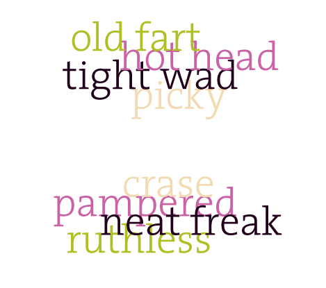
Based on the answers the individual collects a negative word associated with their response.
a. pampered
b. weak
c. fuddy dud
d. tight wad
They continue to answer a series of questions which creates a collection of negative words that they then rate as more or less authentic. Do they then have to display this expression?
Some hypothetical word creations:
or
IDEA 2.5:
Still using the Language Labels. The idea is to attempt to create an authentic expression through language.
The individual answers questions about themselves based on scenarios that they may encounter. Then is given a range of expressions (from negative to positive) based on their decision in which they choose which best describes themselves (a.k.a. - the most authentic).
EXAMPLE SCENARIO QUESTION:
My group of friends from the office are trying out a new restaurant for lunch, which is said to be kind of pricey. When they ask if I want to go I decide to...
a. go on ahead, money is not an issue.
b. go on ahead despite my budgeting restraints.
c. turn the offer down because I brought my own lunch and don't stray off the plan.
d. turn the offer down because I didn't budget for the extra $5 dollars the lunch will cost me.
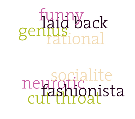
Based on the answers the individual is given a selection of words to choose from.
a. stable, spoiled, pampered
b. socialite, foodie, weak
c. rational, practical, fuddy dud
d. money smart, budgeter, tight wad
The creation is then a somewhat more authentic expression of their own identity.
Visual conventions, visual rhetoric or anything of the like has been the buzz around studio for the past few weeks. What are they? Where are they found? How do we as designers contribute to, create or disrupt them? Next we did experiments in "hybridization" attempting to infuse new visual conventions into the old. Attempting to lead our communities down a path. For the project we were to...
1. Identify : existing visual conventions of the community you have selected to study in seminar.
2. Design : An Initiation to ________ , introducing new visual conventions that might logically follow, or interrupt, if such is the more compelling strategy. Any media, any point of delivery.
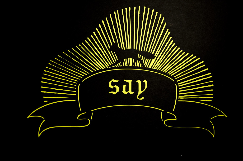
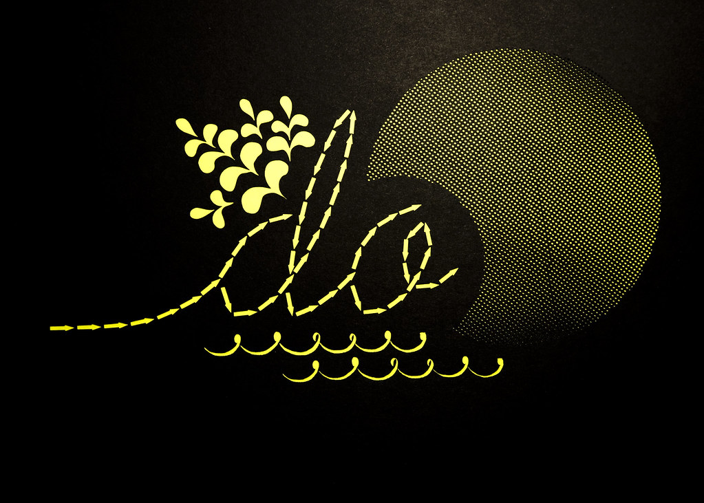
My community of intrigue for this entire semester has been Weardrobe.com, a social platform for personal fashion. It is a fashion-focused community for discovering different ways to wear clothing. Weardrobers are all about imagination and creativity over consumption. After much consideration my initiation for the community is into ACTIVISM. And here is my proposal...
Weardrobe community members are invited to participate in a contest rooted in activism. The "Think, Say, Do" campaign encourages members to think creatively about how to incorporate the campaign's branding via tools/stencils into their wardrobe and fashion statements. I developed a branding for the campaign that utilizes the rich "mixing up" visual strategy that Weardrobe embraces. Their fashion ensembles include a mix of high and low fashion as well as their own DIYed pieces. These branding visual elements I came up with were translate into tools for creation (a.k.a. stencils) that I created using black card stock and the handy laser cutter. Here is how it is explained in the packet the Weardrobe participant receives...
Think / Say / Do: The Compliment Campaign.
Sponsored by American Apparel.
Think:
Utilizing the provided stencils and fabric paint get creative and "style up" an existing fashion piece in your wardrobe. Next, submit a photo of you wearing your creation to the Think/Say/Do Weardrobe Competition online. Most importantly, check out the charities listed and select one to represent.
Say:
Compliments equal Cash. Get online and compliment/comment on other participants creations if you dig 'em. Let your friends know to compliment your creation.
Do:
Compliments will be tallied up and American Apparel with donate $1 for each compliment received by the contest winner to their chosen charity.
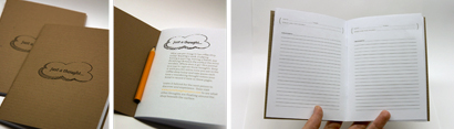
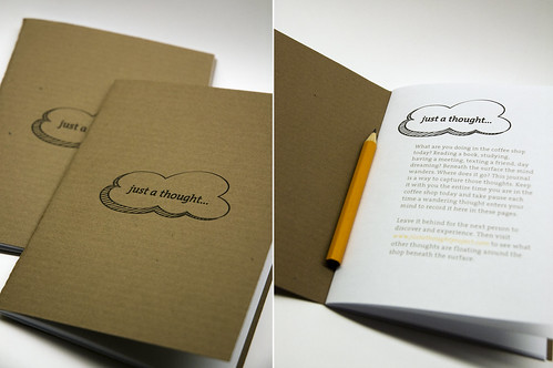
The Thought Journal: When re-evaluating my "thought catcher" I realized that I am interested most in the thought, where the mind wanders while engaged in the ritual of being in the coffee shop. I don't want to be too intrusive in their process I just want to capture the thought as it is happening. And in return make the person aware of the wandering thoughts.
My New Idea: Provide a Thought Catching Journal that is left on the tables for the individual to discover, contribute and explore.
An interior page reads, "What are you doing in the coffee shop today; reading a book, studying, having a meeting, texting a friend, day dreaming? Amidst this facade the mind wanders. Where does it go? This journal here is a way to capture those thoughts. Keep it with you the entire time you are in the coffee shop today and take pause each time a wandering thought enters your mind to record here in these pages.
Before you leave return the thought journal to the collecting bin near the doors and visit www.justathoughtproject.com to see what other thoughts are floating around the shop beneath the surface."
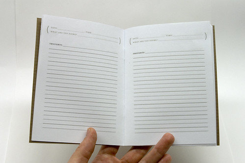
Each page has a place at the top to record the date, time and what they are doing at that time, then space for their thoughts.
The Thought Catcher: Ritual and a Cultural Probe: Are the rituals performed in the coffee shop experience just part of an illusion of busyness or importance, a facade? Where does the mind wander during those ritualistic experiences? What are the thoughts beneath the surface of ritual?
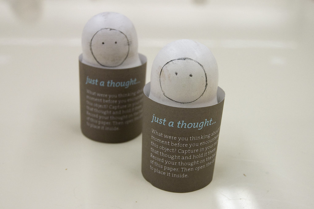
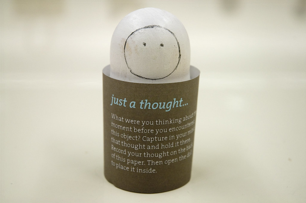
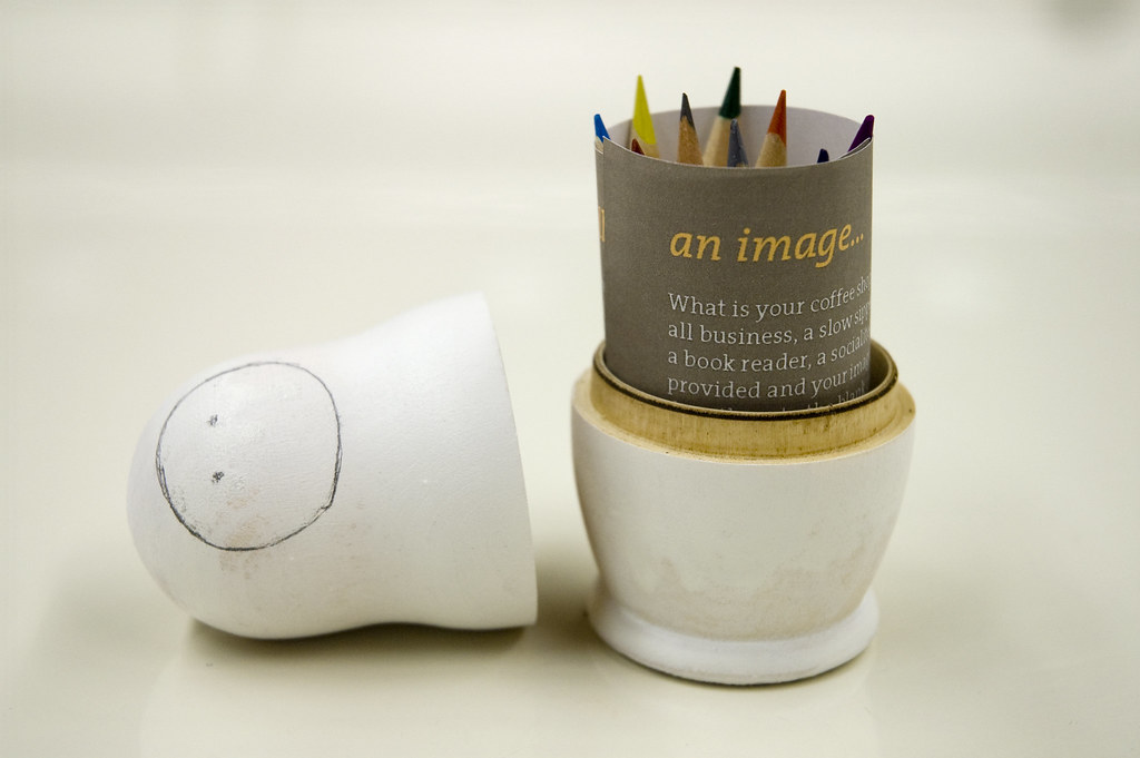
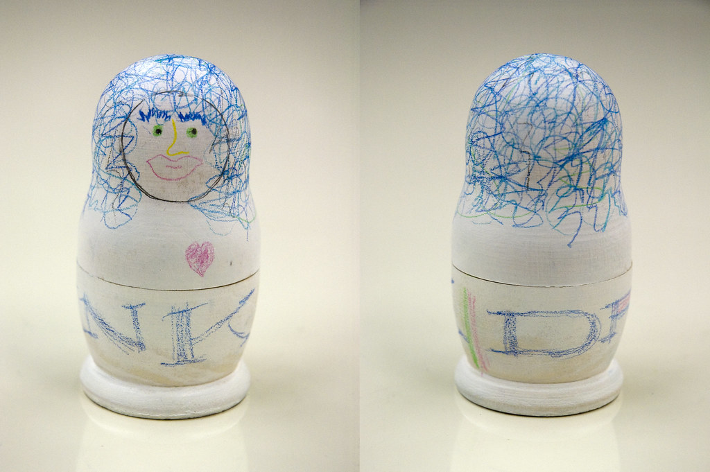
My Probe: A single blank nesting doll is left randomly on tables, with a kit for creation inside including, a sheet of paper with directions and small colored pencils.
The customer is first prompted to capture what they were thinking of the second before they encountered the doll and write that thought on a piece of paper that will then be rolled up and placed inside the nesting doll. They are then encouraged to imaginatively represent their coffee shop persona on the outer most doll (through drawing, color, writing, etc.) and prompted to create directly onto the blank canvas of the doll.
The directions read:
just a thought...
What were you thinking about the moment before you encountered this object? Capture in your mind that thought and hold it there. Record your thought on the back of this paper. Then open the doll to place it inside.
An image...
What is your coffee shop persona? Are you all business, a slow sipper, a day dreamer, a book reader, a socialite? Using the tools provided and your imagination create directly onto the blank canvas of the doll a representation–a sketch, a sentence, or perhaps a single word–of who you are and what you do while here in this coffee shop.
and finally...
Place your captured thought and tools back into the doll and leave it in the collection bin near the register.
Then visit www.justathoughtproject.com
to view other representations and thoughts as well as your own.
Some creativity during critique... contributors: Cady Bean-Smith, Tania Allen & Lauren Waugh...
contributors: Denise Gonzales Crisp, Kelly Bailey & Laura Rodriguez...
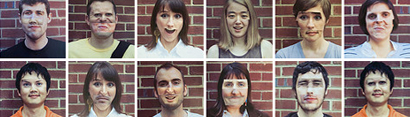
Final Critique was a culmination of all of our work from the past semester. I decided to even bring along a slightly unsuccessful but still intriguing (and hours of hilarity in studio) project too. For part of my Moments of Interface project I was interested in the reflection of one's self and was looking for how I may distort that in unsuspecting ways. I came up with the Face Mash Up.
I mounted images of some of my classmates faces, with specific parts cut out, onto mirrors. The plan was for the individual to encounter the mirror and line themselves up in order to see their own eyes, or nose, or mouth on the classmates face. The whole perspective thing through the project off, but the the cut up images stayed on my desk for the rest of the semester. Each day as I walked in their would be a new creation/mutant waiting to be discovered. We eventually came up with the ultimate mutant, Brooktonia, who was subsequently credited with any shenanigans from then on out. For final critique I managed to get photos from everyone of our classmates and set up a table just outside the crit room so that the fun could continue during breaks. Check out my NCSU Mutants flickr set to see some of the creations we came up with.
And to see more pics from the full day of final critique click here. [...]
For our next three moments of interaction we were to respond to one motivation in 3 different designed environments, while maintaining comparable attributes of experience across. For this round I wanted to push myself to investigate form-making areas I may have never been before, and that meant at least something had to be digital and interactive. I also knew that I wanted to explore the idea of wandering and how that could manifest itself within three different designed environments.
The idea for moment #4 came quickly. I imagined a printed piece/book that wandered. In order to create similar attributes of wandering I constructed a piece that presented options to explore. In moment #5 the viewer is invited to wander within an digital interactive environment. As the participant wanders she discovers bits and pieces of reflective text that may propel her in a new direction. Moment #6 was inspired by the idea to invite individuals to slow down and wander by recognizing and rewarding that physical activity. Intended for physical wall space in hallways this piece responds to the movement of the passerby and creates a visual "wake". The size of the wake is dependent upon the speed of the passerby. Faster individual create smaller wakes, while slower, more wandering individuals create a larger wake which in turn reveals more to the wandering viewer.
The text across all three pieces comes from reflective writings from a "summer journal" which was composed throughout the course of several years but all from a setting by the sea. This influenced and inspired the visual language of each piece.
Moment 4, 5 & 6
Motivation: To step away
Attribute of Interface: Wandering
Attribute: Pleasurable/Inviting/Reflective
In critique for my first interactive moment "Snack Time" we wandered into an area I found quite interesting and tender, the reflection of ones self. For parts 2 and 3 of this 6 part project we were to combine 1 motivation with 1 attribute of experience then combine the same motivation with 1 attribute of experience that shifts the motivation. I choose the motivation of reflection.
Moment 2:
Motivation: To view a reflection of one's self
Attribute: Transformative/Uplifting
Moment 3:
Motivation: To capture a reflection of one's self
Attribute: Unsettling
Thus far this semester we have created some rather compelling studies on interface. Yet throughout our conversations we have found a common inquiry: Why would someone be motivated to interact with an interface in the first place? One could create the most sophisticated, functional or beautiful interface but if if there is no motivation for the individual to interact then the interface is useless.
Project Four focuses on why an individual would be motivated to interact and how the characteristics of the interaction could surprise, delight, initiate reflection and even shift perspectives. The project consists of six instances in which we pair a motivation with an attribute/characteristic of the interactive experience.
Moment 1 for me pairs the motivation of "wanting a snack" with the attribute of "unsettling".
Moment 1
Motivation: Wanting a snack
Attribute: Unsettling
For the performance aspect of this project I was inspired from a past Valentine's Day gift idea that may have been misappropriated and went a little array. One year from Valentine's Day my gift for my husband, Zach, was a book, not necessarily one that he requested or that he would have even been interested in actually reading. In order to disguise the lameness of the gift I decide to orchestrate an elaborate scavenger hunt with impossibly difficult clues all pertaining to love and our relationship and such. The scavenger hunt was painful enough in itself, but seeing as the reward at the end of it all was a book was even more excruciating for Zach. So I decided to attempt to salvage my scavenger hunt idea and send my fellow classmates on a hunt for the rules.
There was also an audio element. The participant listened to a rule then followed a clue with a set of instructions on where to find the next. All along the way they were asked to bend, break or ignore the rules by entering the bathroom of the opposite sex, using their cell phone in the library, ignoring "Do Not Enter" signs and indulging in an abundance of sugary, frosted cookies with sprinkles. I am not sure that it was any less painful then the V-Day experience but at least we got out of the classroom for a bit.
For the typographic interface experience I designed a set of unconventional posters that would encourage the viewer to question the conventions of reading. Along with throwing out the conventional rules of writing and reading I wrapped posters around corners, in doorways, up stairs and on the ceiling. The intention was to inspire or motivate the viewer to alter their patterns of viewing and reading text by breaking the rules.
In the midst of Project Two's Critique we were asked to free write on our reactions to each project. While I found myself writing about things such as; how proud I was of how far everyone had come in their form explorations, questioning how I could condition my body to not need sleep (thus being able to produce much more), magic and illusion, laughing until my face hurts, questioning conventions and even reflecting upon my delight in my decision to come to graduate school at NC State, I found a common theme resonating. It was about rules, how I feel the suffocating need to always follow them and how this has quite possibly stunted my creativity and my ability to truly explore. It seems to have permeated every aspect of my life. I have to follow a recipe, referring to it for every step and have a bit of anxiety if I have to veer at all. One might say my moral compass is painfully strong.
Other fellow classmates have somehow managed to escape this need and have in turn created some rather interesting and delightful things. I always think during presentations, "but, wait, you didn't follow the rules," but I have found that it doesn't seem to always matter. The rules are not the point.
For Project Three we were asked to elaborate on one aspect of these free writings and create another piece of writing that we would "perform" in front of the class. Then use in the creation of a strictly typographic interface. I choose to elaborate on my fascination with the rules and to attempt to break myself free (at least a small bit). I knew that I could not just jump write into breaking rules, so the best way to get a Rule Follower to become a Rule Breaker is to create a set of rules, naturally.
I am sure that there are many more to consider but as a beginner here is where I landed:
The Top Six Rules for Bending, Breaking and Out-Right Ignoring the Rules.
No. 1 | The Cardinal Rule. Never pay attention to anything that begins with the term “Number 1” in any of it’s various forms. You may read and consider and even think to yourself “Oh, that is quite interesting.” But never under any circumstances should you actually do what it instructs. (Due to the fact that you are reading these rules in the first place says you are, at the heart, a Rule Follower. I can assume that you are at odds with yourself and are considering disregarding rule number one to move on to the next Rule. Don’t worry, I would be experiencing the same reaction. This is just the beginning.) You may actually disregard Rule Number 1 for the sake of this assignment and this assignment only.
No. 2 | Question Everything. Question everything. Rules hide in the most unsuspecting places. On signs, in gravity, they are everywhere. In order to ensure that you are never under the bounds of any rules you must be alert at all times.
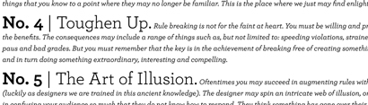
No. 3 | Know the Rules. The key to bending, breaking and ignoring rules is actually knowing those rules in the first place. As stated in Rule Number 1, you may, and I argue must, read and consider the rules then graceful set them aside and start out on a journey all your own. The next step is distorting those things that you know to a point where they may no longer be familiar. This is the place where we just may find enlightenment, where things begin to change.
No. 4 | Toughen Up. Rule breaking is not for the faint at heart. You must be willing and prepared to accept the consequences in order to achieve the benefits. The consequences may include a range of things such as, but not limited to: speeding violations, strained relationships, weight gain, jail time, fashion faux-paus and bad grades. But you must remember that the key is in the achievement of breaking free of creating something, lets say, well structured within the confines of rules and in turn doing something extraordinary, interesting and compelling.
No. 5 | The Art of Illusion. Oftentimes you may succeed in augmenting rules without consequence. This requires great skill in illusion (luckily as designers we are trained in this ancient knowledge). The designer may spin an intricate web of illusion, or rather confusion, for the audience. You may succeed in confusing your audience so much that they do not know how to respond. They think something has gone over their heads and in order to not feel ignorant they remain silent, stunned, offering no criticism. Oftentimes the audience member may go even as far as to praise you for your so-called skills. The ratio of success of illusion can be greatly increased with the study of fields such as: prestidigitation, conjuration, mentalism, escapology, and ventriloquism.
No. 6 | Never Compromise. Never confuse yourself into thinking that in your quest for rule breaking you must go against or compromise your beliefs, standards, physician prescribed life or death health restrictions and/or morals. These things are not necessarily considered rules but rather a personally chosen way of life. If you feel some of them have been imposed upon you unjustly then by all means, get to bending, breaking and ignoring. [...]
A lot has happened since we spoke last. Interface is consuming my life and I have learned a few things along the way. Here is what I've learned thus far:
2/2 - An avocado is a fruit not a vegetable. 2/2 - WORD: Memetic - that which is imitated 2/3 - WORD: Anthropomorphic - having human characteristics 2/4-2/11 - Life is busy, busy, busy... (trust me, I learned lots) 2/12 - Its not perfection but complexity that makes something oh so much more beautiful
For Project Two in our Interface Studio we where designing an interface for interfaces.
1. We began by selecting a genre of designed interfaces. I choose "Toys that Respond"—think Tickle Me Elmo—mainly because I thought it would be much more fun to be working in the genre of toys for this project then something along the lines of politics (although this may not be considered a genre of interface it is the best example I can think of as something that falls rather low on my lists of things that interest enough to illicit further investigation).
2. Next is it parse the genre into a taxonomy. This stage took up the bulk of my time. Wrapping my head first around a genre of interface, then around a taxonomy, then around the taxonomy of interfaces for toys that respond and then keeping all these things in focus was a bit of a process. The research was quite interesting though. I had to resist the urge to actually purchase the USB Hamster and Wheel that runs at a speed consistent with your typing.
3. Then we were to represent the taxonomy of the genre in some form. In an attempt to bring clarity to the complexity of information, my early explorations ended up being a bit too reductive. (see attachment 1) We were all encouraged to develop our visual language and to reveal the complexity and peculiarity of what you are expressing through the form. (see attachment 2)
4. Lastly we were to design an interface for accessing the taxonomy. Many great ideas, but not so much time to implement. (see Video)
To say the least our Thursday afternoon critique lended itself to a great deal of discussion about interface; what it is, what it is not and what the possibilities of interjecting in this "said" or "said not" interface could be. It was productive, not in the way that we all got a pat on the back and a "job well done", but in a way that expanded our individual thinking and the collective conversation on interface. Which is a good thing, considering that we are working with the concept all semester long.
I have decided to shift the focus of my interface project. I am intrigued with my other before-mentioned ideas but ran into a few road blocks. For the camera interface project I was having a difficult time determining how the "thing" would be displayed on critique day and decided to shelve it as a idea to consider in the future. The tactile email interface idea, come to find out, was not totally fitting the parameters of the first project (another idea to shelve for future exploration). So now, after much interface consideration, I am about to step into a critique with my new exploration. Let me give you a brief description:
The space that lies between ourselves and the natural world is our very own perception. Those perceptions that we are peering through, as an interface, control what we see, what we think and how we relate to the world around us. I am attempting to alter and play with the way an individual may perceive a scenic spot, interjecting in the interface between our minds and the world.
More specifically I am encouraging the individual to consider the world as art, the brushstrokes of nature and the beauty that encompasses. The large, transparent, smart tablet sign allows the viewer to capture those brushstrokes in their own unique way then deliver their masterpiece as a virtual postcard.
I will post feedback and a movie after critique. We will see how it goes. [...]
Our first project in Studio this semester (the warm up project) encourages us to explore possibilities with interface by "intervening in an existing interface to reconfigure the condition of contact." The "condition of contact" being the space between two entities and the way they interact. And did I mention that it is due on Thursday, so this is a quicky. While I started off with many ideas such as a floor mat in your bathroom that collects, records and stores your health data, I have narrowed it down to two.
1. Camera interfacing with surroundings, subject and the environment
A camera already collects and tags image with info about camera settings and time of day. What if we added much more sophisticated automatic tagging capabilities? Such as: GPS locations, temperature, weather, lighting, tides, moon phases, events, directional recognition (NSEW) as well as color, landmark and facial recognition.
These capabilities could enhance the way we sort and search our images and ultimately allow for greater capabilities in the way we document our lives.
A number of photographers currently use keyword and tagging systems that allow for sorting and searching capabilities. However, these operations are done manually. We already have the technology to pinpoint gps locations, from here the camera could collect geographic information such as name of city, weather conditions, temperature, moon phases, tides (if applicable), etc. Upon uploading images you can view tagged metadata and choose to deny or alter certain tags to customize.
Example:
Standing on the beach on the west coast of Florida I am taking a picture of my sister at sunset. The camera can pick up and record my GPS location from here it determines that I am on a beach and based on the time of day and the current sunrise and sunset charts that I am facing East at the time of sunset. It is May and the temperature is 79 degrees at that moment in time with partly cloudy skies. My images will be tag with these things:
Boca Grande, FL
7:12 p.m.
island
beach
sunset
79 degrees
Partly Cloudy
Low Tide
¼ moon
yellow
orange
red
pink
purple
blue
Caitlin Maxcy (my sister)
2. Individual interfacing with email in a more natural way
Purpose: To allow the electronic mail process to mimic characteristics of the physical mail experience.
The way we currently “work” with email seems rather counter intuitive and unnatural. It is removed from our natural, physical mail behaviors. Why don’t we bring back in some of the tactile elements as well as collecting and sorting methods that we are familiar within our current schema of physical mail.
The system would be much more visual and tactile.
Characteristics of mail:
Tactile
Handwritten messages
Retrieved from Mail box
Collected and posted (invitations, cards, announcements, etc.)
Anticipation when opening a card or invitation
Can easily see direct mail and make quick judgment on whether to save or toss.
Sorted into piles of personal, bills, forwards, junk, etc.
Bills are sorted into trays to pay all at once.
Emotional Characteristics of the physical process:
Anticipation
Excitement
Sense of accomplishment
(Could have a recycle function where all “trashed” emails could make up a piece of art.)
I am a second year Masters of Graphic Design Candidate at North Carolina State University. And this (hand, in a sweeping motion, gestures across screen) is my blog.